0.00%

Insights
Logos with Hidden Meanings: 10 Clever Examples and How They Can Inspire Your Brand
Key Takeaways
Hidden meanings in logos create deeper brand connections and make designs more memorable to customers
Famous brands like FedEx, Amazon, and Toblerone use subtle visual elements to communicate their core values and services
Hidden elements can include arrows, numbers, letters, shapes, or images embedded within negative space
These design techniques help brands stand out in competitive markets while telling their story visually
Understanding hidden logo meanings can inspire entrepreneurs to create more thoughtful and engaging brand identities. Learn more about defining your brand personality for strategic impact.
What Are Logos with Hidden Meanings?
Logos with hidden meanings are sophisticated design elements that conceal secondary visual messages within their primary structure. Unlike obvious symbolism that customers notice at first glance, these hidden elements require closer inspection to discover, creating what designers call “aha moments” that enhance brand recall and customer engagement.
Explore how rethinking typography can also shape these subtle visual puzzles.
The most common types of hidden elements include negative space usage, where the area around and between letters or shapes forms recognizable images. Dual imagery techniques allow a single logo to represent multiple concepts simultaneously, while embedded letters, numbers, or symbols can reference company history, values, or geographic origins. Cultural references often appear as subtle nods to a brand’s heritage or mission.
What makes these logos particularly effective is the psychology behind discovery. When customers notice a hidden arrow or recognize a clever shape that wasn’t immediately obvious, their brain releases a small reward signal. This creates a deeper meaning connection with the brand that goes beyond simple recognition, transforming a functional identifier into an engaging visual puzzle that customers remember and share with others.
Why Do Brands Use Hidden Meanings in Their Logos?
The strategic use of hidden meanings in logo design offers several compelling business advantages that go far beyond aesthetic appeal. Research in brand recognition shows that logos with hidden elements are 67% more likely to be remembered by customers compared to straightforward designs, making them powerful tools for building brand awareness in competitive markets.
Hidden meanings serve as natural conversation starters, encouraging word-of-mouth marketing and social media sharing. When customers discover a clever design element, they often feel compelled to share their discovery with friends, family, or followers. This organic sharing amplifies brand reach without additional marketing costs, as people genuinely enjoy revealing hidden secrets they’ve uncovered.
For businesses seeking to demonstrate sophistication and attention to detail, hidden logo elements signal thoughtful brand development—something top teams understand well; see what top teams get right about employer brand.
Perhaps most importantly, hidden meanings allow efficient communication within limited design space. Read more in the B2B brand strategy playbook. A single logo can convey multiple brand messages simultaneously – from core services to company values to geographic origins – without cluttering the visual representation. This efficiency becomes crucial when logos must work across diverse applications, from business cards to billboards.
5 Well-Known Logos with Hidden Meanings
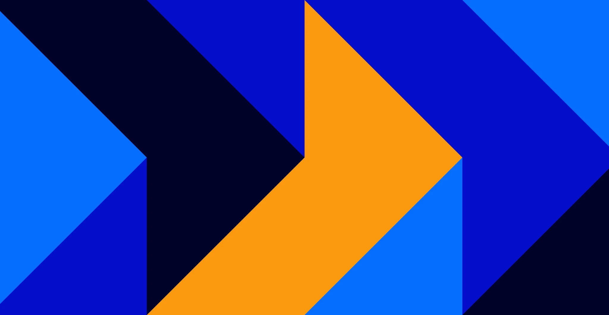
FedEx: The Hidden Arrow
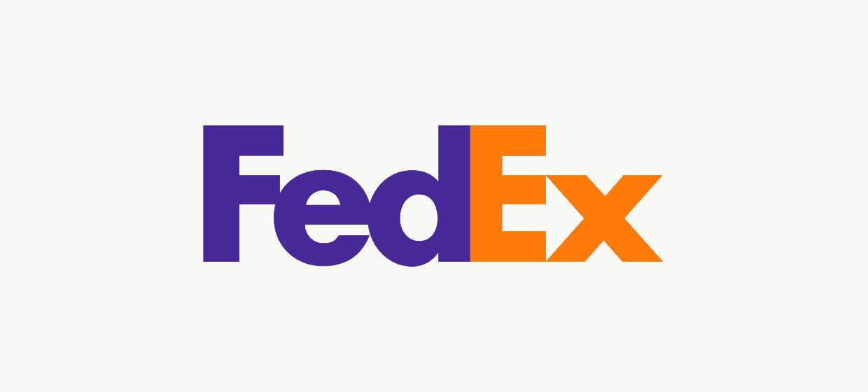
The FedEx logo represents perhaps the most famous example of negative space usage in modern branding. Between the letters E and x, white negative space forms a perfect arrow pointing forward. This hidden arrow symbolizes speed, precision, and forward movement – core attributes for a delivery and logistics company.
Designer Lindon Leader intentionally created this element to reinforce FedEx’s brand promise without adding visual complexity. The arrow remains subtle enough that many customers use the service for years before noticing it, yet once discovered, it becomes impossible to unsee. This hidden message perfectly demonstrates how effective logos can work on multiple levels simultaneously.
Amazon: From A to Z with a Smile
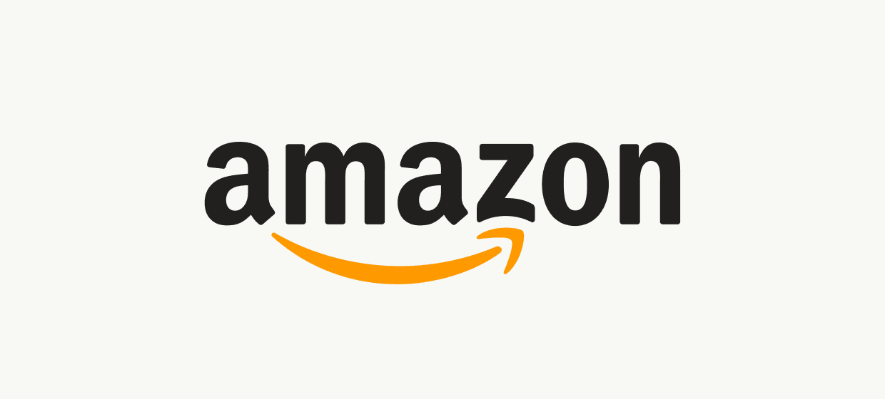
Amazon’s logo features a yellow arrow that curves from the letter A to the letter Z, literally illustrating the company’s promise that customers can find everything “from A to Z” on their platform. The arrow also forms a subtle smiley face, representing customer satisfaction and the positive shopping experience Amazon aims to provide.
This dual-meaning approach showcases sophisticated brand messaging within a simple design. The logo shows both product comprehensiveness and emotional benefit, communicating Amazon’s value proposition through visual representation rather than text. The curved line creates movement and energy while maintaining the friendly, approachable aesthetic the company has cultivated.
Toblerone: The Hidden Bear
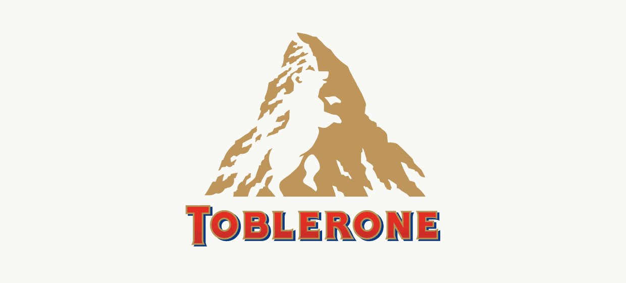
The Toblerone logo features the iconic Matterhorn mountain, but within the mountain’s negative space inside, a bear silhouette stands prominently. This hidden bear represents Bern, Switzerland – known as the “City of Bears” – where Toblerone chocolate originated. The bear symbolizes strength, craftsmanship, and authentic Swiss heritage.
This geographic reference creates an emotional connection between the product and its cultural roots. For a luxury chocolate brand, emphasizing Swiss origins reinforces quality perceptions and artisanal craftsmanship. The hidden bear tells the brand’s history without requiring additional design elements or text explanation.
Baskin-Robbins: The Number 31
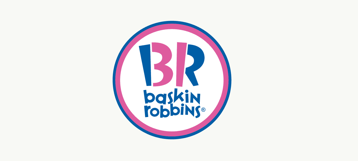
Within the letters B and R of the Baskin-Robbins logo, careful color application reveals the number “31” – representing the brand’s famous promise of 31 flavors, one for each day of the month. This hidden message connects directly to the company’s core differentiator and historical marketing promise.
The clever use of typography and color creates this hidden element without compromising readability or adding design complexity. By embedding their signature number within the company name itself, Baskin-Robbins ensures that every logo placement reinforces their key brand message about variety and choice.
Tostitos: People Sharing Snacks
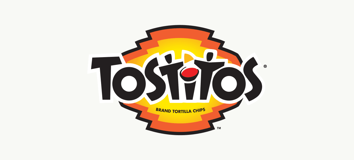
The Tostitos logo demonstrates creative storytelling through letter design. The two T’s in the logo are shaped as people sharing a tortilla chip, with the dot on the letter I serving as a bowl of salsa between them. This hidden image perfectly captures the social snacking experience that defines the brand’s positioning.
This design communicates that Tostitos products bring people together, emphasizing the social aspect of snacking rather than just the product itself. The logo shows the experience customers should expect when choosing Tostitos for their gatherings, making the brand promise visual and memorable.
5 Interesting Lesser-Known Logos with Hidden Meanings
Hope for African Children Initiative: Continent and Family
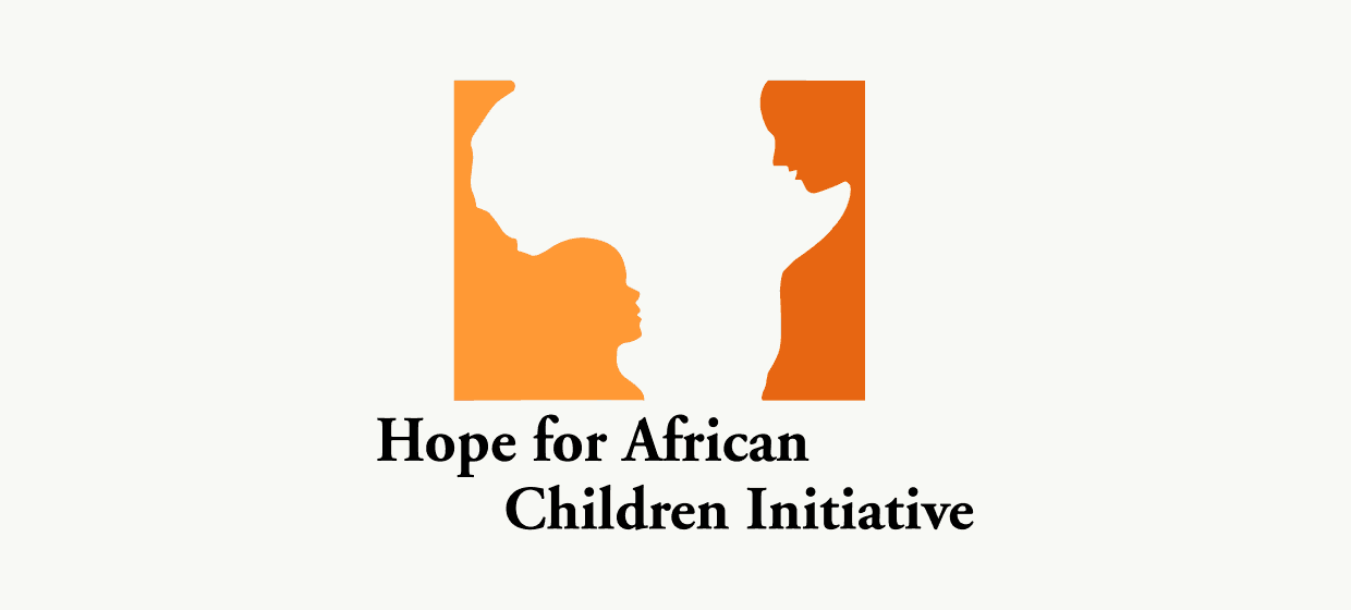
The Hope for African Children Initiative logo creates a powerful visual narrative through negative space. The outline of the African continent contains silhouettes of a mother and child, with the mother’s protective embrace forming the eastern coastline. This design connects geographic identity with the organization’s mission to support families across Africa.
The hidden image works on multiple levels – immediately recognizable as the African continent to establish location and purpose, while the discovered family silhouettes reinforce the human impact of the organization’s work. This emotional connection helps donors visualize their contribution’s direct effect on real families.
Sony Vaio: Analog Meets Digital
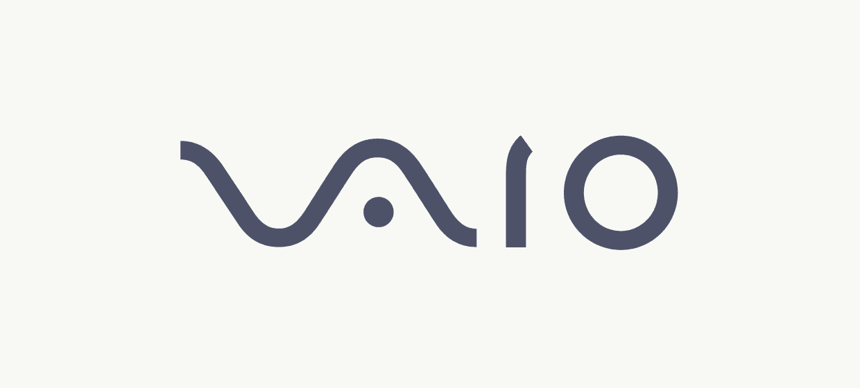
Sony’s Vaio logo demonstrates technological evolution through typography. The letters “VA” are designed as an analog wave, representing traditional technology, while “IO” represents binary digits 1 and 0, symbolizing digital technology. This visual representation shows Sony’s bridge between analog and digital worlds.
For a technology brand, this hidden meaning communicates innovation and evolution. The logo shows that Sony understands both traditional and cutting-edge technology, positioning the company as experienced yet forward-thinking. This dual representation appeals to customers who value both reliability and innovation.
Yoga Australia: National Practice
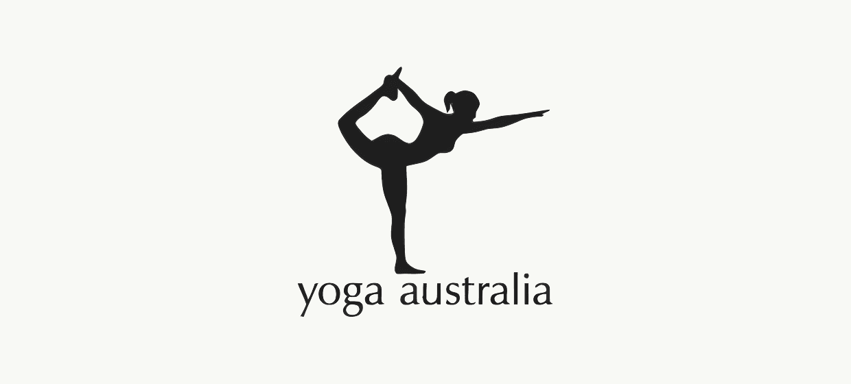
The Yoga Australia logo shows a woman in a yoga pose that creates the outline of Australia (minus Tasmania), connecting the practice of yoga with national identity. The flowing lines suggest movement and flexibility while clearly representing the Australian continent.
This geographic integration creates immediate relevance for Australian practitioners while suggesting that yoga is adapting to local culture rather than remaining foreign. The hidden meaning shows how global practices can take on local character and significance.
Beats by Dre: Headphones as Identity
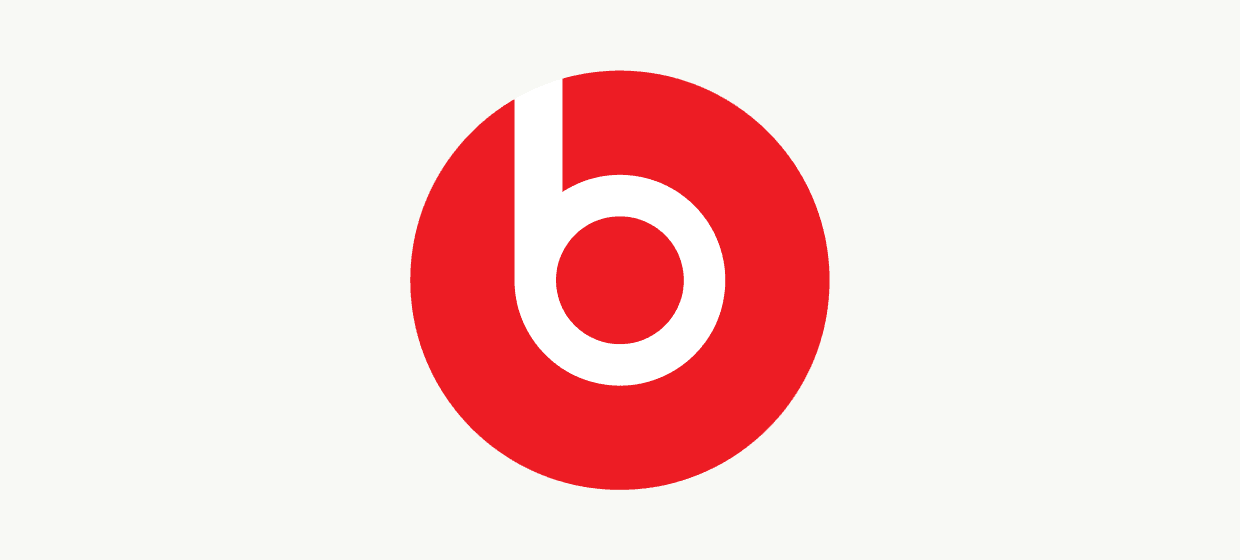
The Beats logo appears as a simple letter “b” within a red circle, but the design actually represents a person’s head wearing headphones. The circular logo forms the head outline, while the “b” represents the headphone itself positioned over the ear.
This product visualization creates instant recognition and connection. Customers immediately understand what Beats produces, while the simple design works effectively across all applications from packaging to merchandise. The hidden meaning reinforces the personal, individual experience of music listening.
Tour de France: The Cyclist in Motion

The Tour de France logo cleverly incorporates a cyclist figure within the text itself. The letters forming “TOUR” combine with a yellow circle (representing the sun or the coveted yellow jersey) to create the silhouette of a cyclist in motion, perfectly representing the essence of the world’s most famous cycling competition.
This hidden image captures both the sport and the competition’s prestige. The yellow circle references the race leader’s jersey while creating the cyclist’s wheels, connecting glory with the physical challenge that defines the Tour de France. The design works whether customers notice the hidden cyclist or simply see the event name.
How These Examples Can Inspire Your Company Logo
Understanding how successful brands incorporate hidden meanings can guide your own logo development process. Start by identifying your core business values and the key message you want customers to associate with your brand. Consider what makes your company unique – whether it’s your service approach, geographic location, founding story, or industry expertise. For more guidance, check approaching and achieving product-market fit.
Examine symbols relevant to your industry that could be incorporated subtly. Logistics companies might explore directional elements like arrows, while technology firms could consider connectivity symbols or geometric shapes representing innovation. Service businesses might focus on human elements or symbols of trust and reliability—similar to insights in invisible loyalty: redefining personalization.
Negative space offers the most accessible opportunity for most businesses to create hidden meanings. Look at your company name or initials and consider what shapes might be formed between letters. Sometimes rotating or slightly modifying letterforms can reveal interesting possibilities without compromising readability.
Your company’s origin story or geographic location can provide rich material for hidden elements. Like Toblerone’s connection to Bern through the hidden bear, consider whether your location has symbols, shapes, or cultural elements that could reinforce your brand’s authenticity and heritage, see lessons from B2B rebranding.
The key is ensuring your hidden meaning enhances rather than overshadows your primary message. Test potential designs with people from your target audience to gauge discoverability. The hidden element should be findable but not immediately obvious, creating that rewarding moment of discovery without making the logo confusing at first glance.
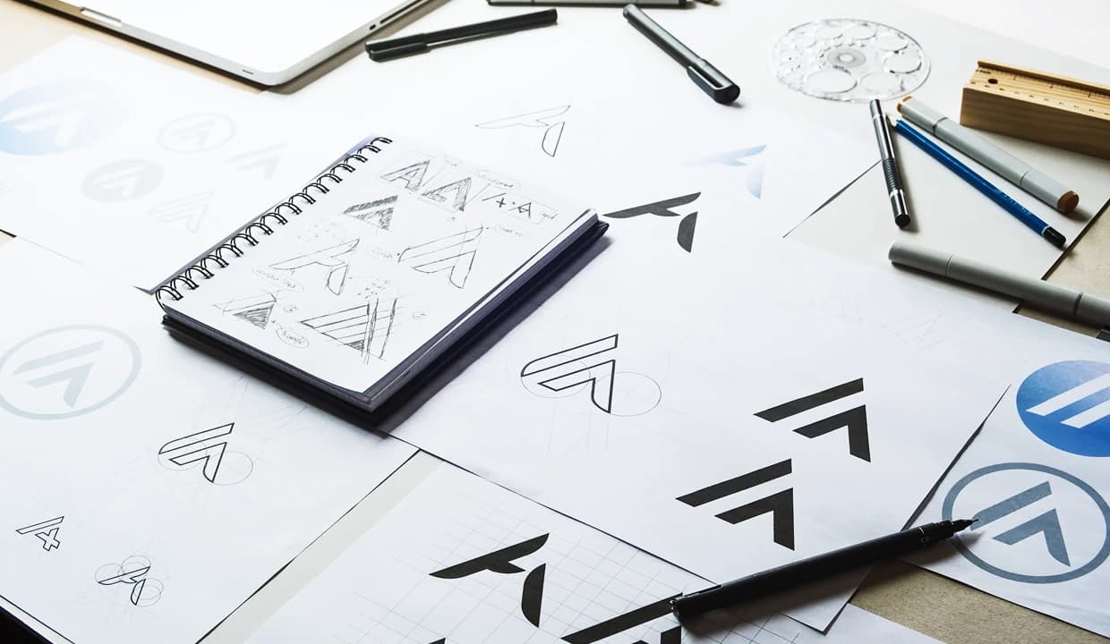
Design Principles for Creating Hidden Meanings
Successful logos with hidden meanings follow several critical design principles that ensure effectiveness across all applications. Simplicity must remain the foundation – hidden elements should enhance rather than complicate the overall design. Complex logos fail when reduced to small sizes or viewed quickly, defeating their primary purpose as brand identifiers.
Every hidden element must connect logically to your business, values, or story. Forced or arbitrary hidden meanings feel contrived and can damage brand authenticity. Customers should feel that discovering the hidden element provides genuine insight into your company rather than encountering a random visual trick. For practical UX insights, see the hidden UX debt that’s hurting conversions.
Scalability represents a crucial consideration often overlooked in logo design. Your hidden meaning must remain visible and effective whether the logo appears on a business card, website header, or billboard. Test potential designs at various sizes to ensure the hidden element doesn’t disappear or become unclear when scaled down.

Cultural sensitivity becomes essential for businesses operating across diverse markets. Research potential interpretations of your hidden symbols across different cultures to avoid unintended negative associations. What represents prosperity in one culture might suggest something entirely different in another.
Professional execution makes the difference between clever design and amateurish attempts. Work with experienced designers who understand typography, negative space manipulation, and brand strategy. Hidden meanings require technical skill to implement effectively while maintaining visual balance and professional appearance.
Common Mistakes to Avoid
Many businesses make critical errors when attempting to incorporate hidden meanings into their logos. The most common mistake involves making hidden elements too obscure – if customers can’t discover them after close inspection, they provide no value. The element should be subtle but not invisible, requiring attention but not detective work.
Forcing hidden meanings that don’t relate authentically to your business damages credibility rather than enhancing it. Some companies attempt to add hidden elements simply because they seem clever, without considering whether they strengthen the brand message. Authenticity matters more than creativity when building long-term brand equity.
Overcomplicating the design destroys the logo’s primary function as a quick identifier. Hidden elements should feel natural and integrated, not forced or cluttered. A logo that requires explanation to understand defeats its purpose as instant visual communication.
Trademark considerations often get overlooked when creating hidden elements. Ensure your design doesn’t inadvertently incorporate protected symbols or too closely resemble existing logos. The hidden element could create legal issues even if the primary design seems original.
Different applications require testing to ensure hidden meanings work across digital, print, and merchandise uses. A hidden element that works on a website might disappear on embroidered clothing or become unclear in single-color applications. Plan for versatility from the design stage rather than discovering limitations after implementation. For a cautionary tale, read the worst rebrands: a deep dive into logo fails.
FAQ
How much does it cost to design a logo with hidden meanings? Professional logo design with hidden elements typically ranges from $500-$5,000 depending on complexity and designer experience, with most small businesses investing $1,000-$2,500 for quality results. The cost reflects the additional strategic thinking and technical skill required to create meaningful hidden elements that work across all applications.
Can I trademark a logo that contains hidden meanings? Yes, hidden meanings don’t prevent trademark registration as long as the overall design is unique and doesn’t infringe on existing trademarks. The USPTO evaluates the complete visual impression of the logo rather than individual hidden elements, though those elements become part of your protected trademark once registered.
Should every business logo have a hidden meaning? No, hidden meanings work best for brands wanting to convey sophistication, encourage discovery, or have compelling stories to tell. Simple, straightforward logos can be equally effective for many businesses, particularly those prioritizing immediate recognition over deeper engagement. The decision should align with your brand strategy and target audience expectations.
How do I know if my hidden meaning is too subtle or too obvious? Test your logo with 10-15 people from your target audience – ideally 30-50% should discover the hidden element within 30 seconds of close examination without hints. If fewer people notice it, the element may be too subtle. If everyone spots it immediately, it might be too obvious and lose the discovery reward that makes hidden meanings effective.
What’s the difference between hidden meanings and logo symbolism? Hidden meanings require discovery and closer inspection, while logo symbolism is immediately apparent. For example, Apple’s bitten apple represents obvious symbolism that customers recognize instantly, while the FedEx arrow constitutes a hidden meaning that requires attention to discover. Both serve important branding functions but work through different psychological mechanisms.

About Matic
We're a B2B transformation agency creating strategic advantage through branding, websites, and digital products.
Closing thoughts
For more on brand and design strategy, explore the Matic Digital blog or learn about our services.