0.00%
Branding
Typography and Brand Design: Rethinking Typography as Brand Infrastructure
Share Article


Introduction to Brand Identity
Brand identity is the sum of all the visual and tonal elements that define how a brand is perceived by its audience. It’s more than just a logo or a color palette—it’s the complete personality and image a brand projects across every touchpoint. Typography plays a pivotal role in shaping this identity, acting as a bridge between a brand’s values and the way it communicates with its target audience. The fonts chosen, along with thoughtful decisions about font size and line spacing, help set the tone for all brand messaging.
Branding typography is about more than picking attractive fonts; it’s about selecting typefaces that reflect the brand’s mission, values, and personality. Consistent use of brand identity typography across all materials—from digital screens to print—ensures that every interaction reinforces the brand’s image. Proper typography not only enhances readability but also makes the brand more memorable and relatable. When typography is aligned with the brand’s overall identity, it helps build recognition, trust, and a lasting connection with the target audience. (see Branding Strategy: The Ultimate Guide for Building a Strong Brand).
Typography Isn't Decoration. It's Brand Identity Infrastructure.
Typography is more than a visual utility - it’s one of the most scalable, cross-functional tools a brand has available. It builds trust before a word is read. As a critical element in branding, the role of typography extends beyond aesthetics, shaping the brand’s perception and influencing how audiences experience the brand. It helps teams communicate clearly. And when it’s treated like infrastructure it becomes a quiet engine driving brand positions.
Growing brands and established ones alike leverage typography like a codebase for brand behavior - living across presentation collateral, marketing outputs, web and app interfaces, sales outreach, and internal documents. When used well, typography in branding is central to the brand’s identity; it doesn’t just support the brand. It is the brand. Typography reflects and reinforces the brand's identity and brand's personality, ensuring that every visual element aligns with the company's values and traits. (related: Defining Your Brand Personality Is a Strategic Move).
Typography plays a vital part in creating and conveying the brand's message and values, ensuring consistency and emotional connection across all touchpoints.
Typography is strategic, not stylistic
Many teams still treat typography as a one-time design decision. Choose a font, apply it, move on.
But the most effective brands operationalize typography as part of how they run. It shows up not just in marketing, but in HR documents, sales decks, product UIs - anywhere the brand needs to communicate. Picking fonts that align with your brand’s values and messaging is crucial, as the right typefaces help reinforce your brand identity at every touchpoint. When you choose fonts, consider how your font choice communicates your brand’s personality, evokes emotion, and ensures readability for your audience. When embedded intentionally, typography sets the tone, reflects and reinforces brand personality, directs attention, and brings clarity to complex ideas. Effective font pairing is essential for visual harmony, and selecting the right typeface is key to creating a memorable and cohesive brand identity. It creates cohesion across teams and touchpoints.
In that way, it becomes more than a visual choice. It becomes part of your organization’s operating system rather than another page in the brand guidelines.
Every type system services two functions
Expressive type creates distinction. It generates emotion, builds recognition, and anchors memory. The choice of typeface and lettering in logo design is crucial—logos like Coca-Cola’s iconic script or The New York Times’ masthead are prime examples of how specific styles and letters are created to reinforce brand identity. These logos use distinctive typefaces and unique lettering styles, making their letterforms instantly recognizable and deeply tied to their brand personality. The use of different typefaces and font styles helps tell a brand's story by conveying its values, message, and personality, ensuring the typography supports the emotional connection with the audience. The careful design of letters and the overall lettering style in these logos demonstrates how expressive typography can elevate a brand’s visual identity.
Neutral type builds trust. Neutral type is used in dashboards, UIs, internal tools. It functions without being in the way of user experience. Inter. Helvetica. System fonts. These choices prioritize usability and clarity.
The strongest systems know when to be expressive - and when to disappear.
Type as infrastructure
Typography is a structural tool. In digital environments, it’s as important as layout, navigation, or content strategy.
A strong type system will:
Define hierarchy and flow
Scale across screen sizes and use cases
Reduce friction for writers, designers, and devs
Brings consistency to every expression of the brand - externally and internally
Ensure typography is optimized for digital screens and website consistency
Using a font family with a range of weights provides flexibility and helps establish visual hierarchy
Using web fonts is essential for digital adaptability and helps maintain brand typography across platforms.
A well-built typography system isn’t just for the design team. It should be easy to adopt across decks, tools, campaigns, and yes, even internal memos. Consistent body copy and body text are essential for your brand’s typography and overall brand cohesion. Using the same fonts across all materials and touchpoints reinforces brand consistency, recognition, and professionalism, while ensuring your brand's typography aligns with other brand components to create a unified brand personality. The more frictionless it is to use, the more cohesive your brand becomes. For more on that, check out our thinking on Enterprise Design Systems.
To make your brand system cohesive and your experiences more usable, start with typography.
When type Is the experience
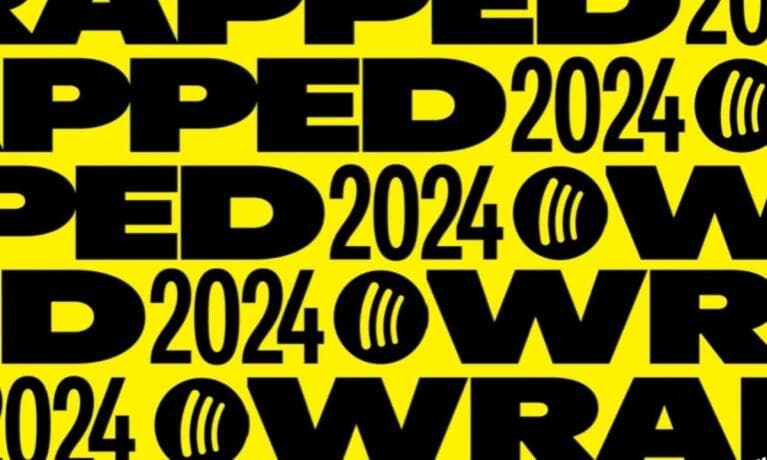
Sometimes, typography moves from supporting role to center stage.
Take Spotify Wrapped. The bold fonts, kinetic type animations, and microcopy aren’t just decorative—they are the experience. Personal data becomes a branded cultural moment. Investing in a good brand font can help your brand stand out, making the experience more memorable and ensuring your brand presence is both unique and timeless.
Or look at this ‘throwback’ visual from Jay-Z’s Brooklyn Go Hard video:
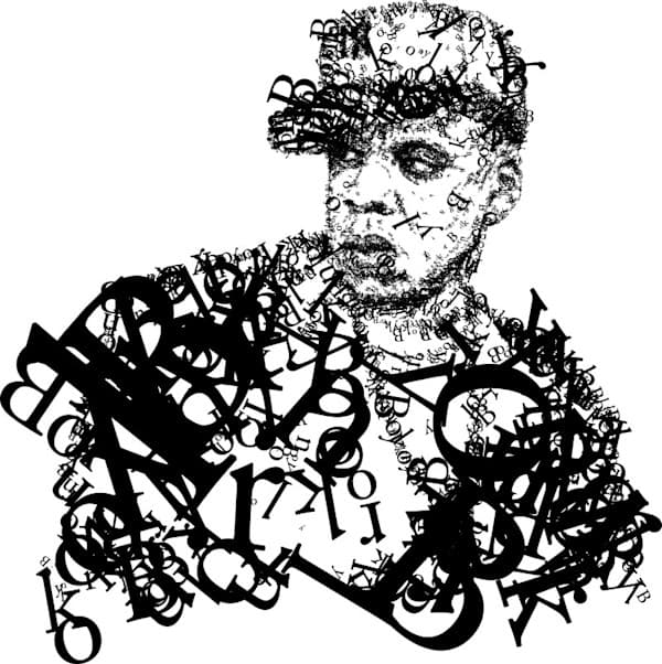
A portrait built entirely from type. Every contour, every detail formed from letterforms. Here, images and type work together in creating a powerful visual narrative that enhances brand identity. It’s expressive, raw, unforgettable.
Sometimes, type is most powerful when it goes beyond supporting the message and becomes the message, conveying brand identity and emotion through typographic experiences.
From concept to system: GoDaddy's .Design
In our rebrand of GoDaddy Registry’s .Design product, we took the same approach. It’s a global offering for creative professionals - spanning multiple languages, devices, and regions. The typographic system was created to support the brand’s needs, ensuring consistency and effective communication across all touchpoints.
We built a typographic system that felt both modern and human. In modern branding, open source fonts and free fonts are often leveraged for their flexibility, accessibility, and cost-effectiveness, making them ideal for startups and businesses seeking contemporary, web-friendly solutions. We considered different styles, including serif, sans-serif, and script fonts, each playing a vital role in shaping the overall brand experience. We refined every detail, from font weight to spacing to responsiveness, ensuring the typography was calibrated to support clarity, personality, and usability without overpowering the content.
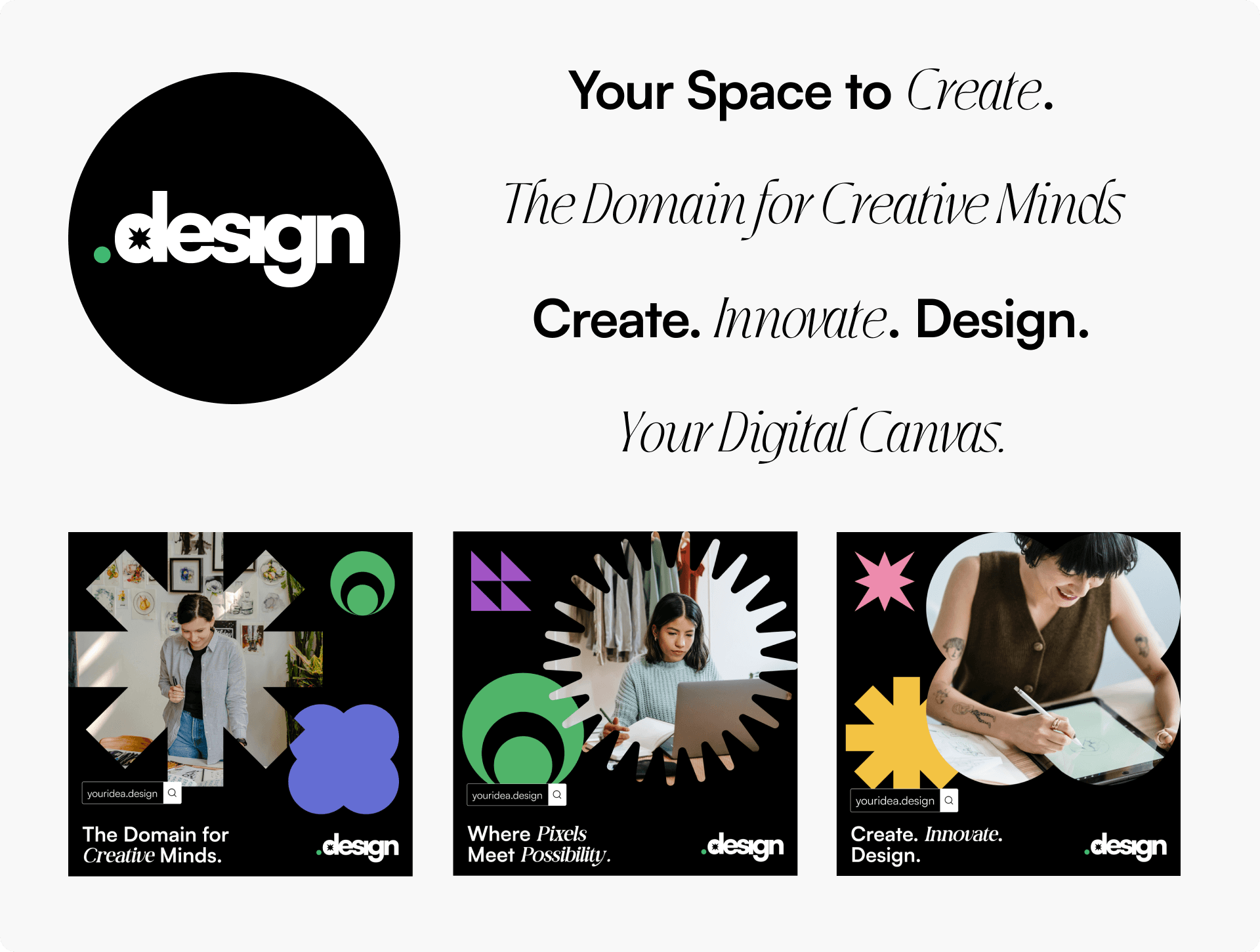
Typography wasn’t just a layer of the brand. It was the connective tissue.
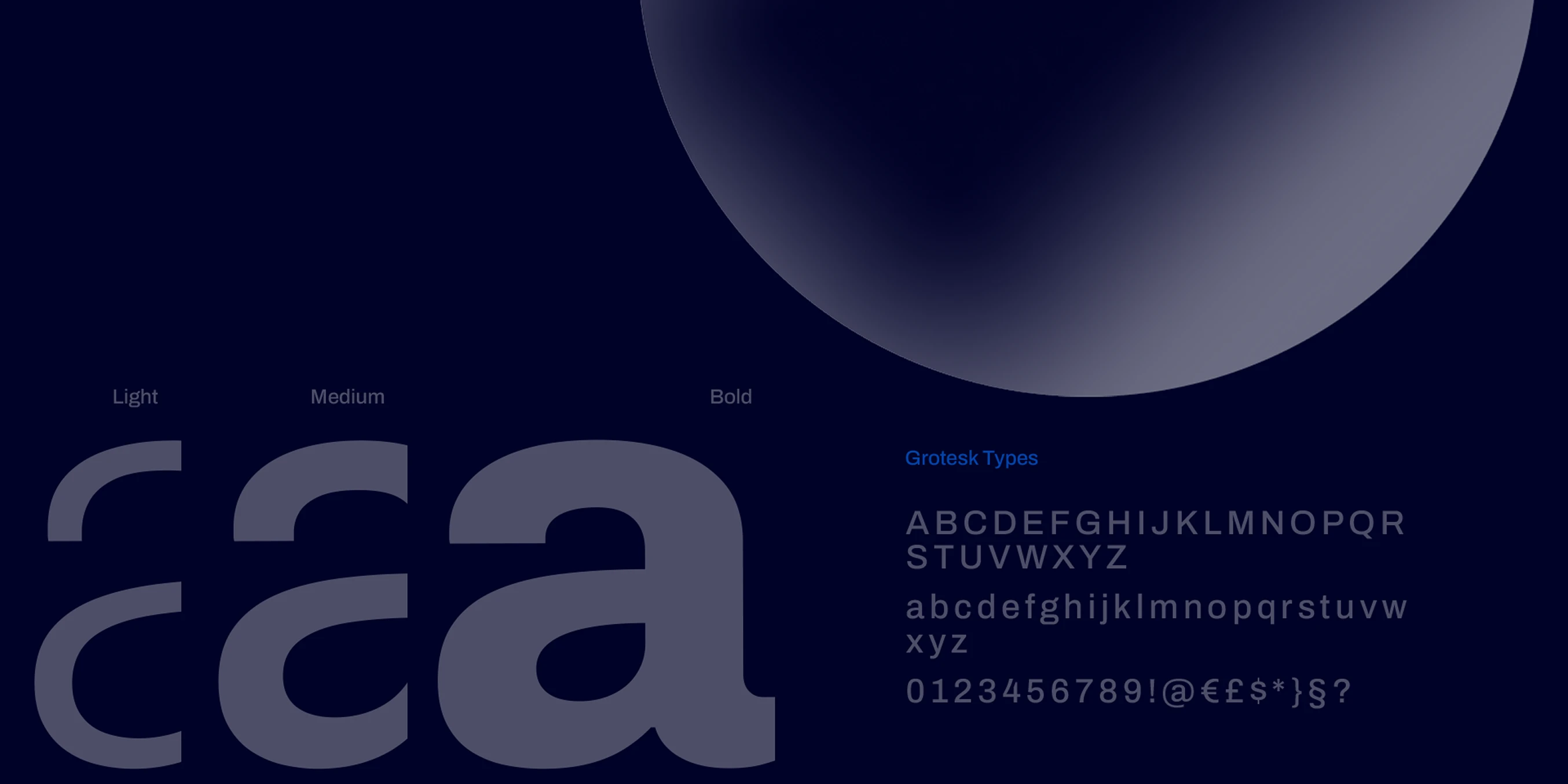
Truths of serif fonts in typography
Consistency scales Most brands only need two to three typefaces. Selecting brand fonts and maintaining consistent font styles is essential for reinforcing your brand’s identity and ensuring a cohesive visual experience. Let size, weight, and spacing do the heavy lifting.
Legibility is non-negotiable Good type supports reading. Think line height, contrast, and whitespace. Good typography also plays a crucial role in making content accessible, especially for users with visual impairments. Your typography should be accessible to all users, ensuring inclusivity and usability.
Context matters What works in a keynote won’t work in a mobile app. Choosing versatile typography ensures that it works well across various media and applications, adapting seamlessly to different contexts.
Voice over trend Match your type to your brand’s tone, not to what’s trending. Choosing the right font helps connect with your target consumers and ensures your brand’s message is communicated clearly and effectively. Selecting the right fonts is crucial for reinforcing brand identity and building strong brand recognition.
The Role of Display Fonts
Display fonts are designed to make an impact. Unlike body text fonts, which prioritize readability, display fonts are used in headings, titles, and other prominent areas where grabbing attention is key. In branding, the right display font can instantly communicate a brand’s personality and set the tone for the entire visual experience.
For example, a luxury brand might choose a classic serif font as its display font to evoke a sense of tradition, elegance, and sophistication. This approach creates a visual hierarchy that draws the eye and leaves a lasting impression. On the other hand, a tech startup might opt for a bold, modern sans serif font to signal innovation and approachability. The strategic use of display fonts helps brands become instantly recognizable, ensuring that their most important messages stand out in a crowded marketplace.
By carefully selecting display fonts that align with the brand’s identity, companies can reinforce their visual hierarchy, differentiate themselves from competitors, and create a memorable brand experience that resonates with their audience.
Custom Fonts and Brand Differentiation
Custom fonts offer brands a powerful way to stand out and create a truly unique visual identity. Unlike off-the-shelf typefaces, a custom font is crafted specifically to reflect a brand’s personality, values, and messaging. This level of customization allows brands to express themselves in a way that is both distinctive and consistent across all platforms.
Investing in custom typography demonstrates a commitment to quality and attention to detail, signaling to customers that the brand values originality and excellence. A custom font can be used across digital channels, print materials, packaging, and more, ensuring a cohesive look and feel wherever the brand appears. This consistency strengthens brand recognition and helps build a strong, memorable connection with the audience.
Custom fonts also provide flexibility, allowing brands to adapt their visual identity as they grow and evolve. By developing a custom typeface, brands can ensure that their typography remains a valuable asset—one that sets them apart from competitors and reinforces their unique story at every touchpoint.
Brand Style Guide and Consistency
A brand style guide is the blueprint for maintaining a consistent and cohesive visual identity. It outlines the rules for using all visual elements, including typography, ensuring that every piece of communication aligns with the brand’s standards. A comprehensive brand style guide covers everything from font selection and font sizes to line spacing and the use of visual elements in both digital and print materials.
By providing clear guidelines for typography, a brand style guide helps teams make informed decisions about how to present the brand across different platforms and contexts. This consistency is crucial for building trust and recognition with the target audience, as it ensures that the brand’s voice and personality are always represented accurately.
A well-defined brand style guide not only streamlines the creative process but also empowers everyone involved in brand communications to deliver a unified message. By following these guidelines, brands can reinforce their visual identity, enhance readability, and create a strong foundation for all future branding efforts.
The Psychological Impact of Typography
Typography refers to the art and technique of arranging type to make written language legible, readable, and visually appealing.
Typography plays a crucial role in shaping brand perception and evoking specific emotions in your target audience. The psychological impact of typography is a vital element in branding, influencing how consumers feel about and respond to a brand—often before they read a single word. The fonts chosen for a brand’s identity—whether sans serif fonts, serif fonts, script fonts, or display fonts—each bring their own personality and mood, making the right typography essential for building a strong visual identity.
Luxury brands, for example, often rely on classic serif fonts to convey elegance, tradition, and sophistication. The timeless appeal of a classic serif font can instantly signal exclusivity and heritage, as seen in many high-end fashion houses. In contrast, modern brands frequently opt for clean sans serif fonts to project innovation, simplicity, and a forward-thinking attitude. This approach is especially effective for tech companies and startups aiming to appear approachable and cutting-edge.
The psychological impact of typography extends beyond font type. Font size, line spacing, and letter spacing all contribute to how a message is received. Generous white space and sufficient contrast between text and background enhance readability, while a carefully selected font family ensures visual consistency across different platforms and touchpoints. High-contrast color combinations improve legibility, especially on digital platforms. Consistent typography—applied across websites, social media, and print—helps create an instantly recognizable brand image and strengthens brand recognition.
Different fonts can also evoke specific emotions and associations. Bold fonts convey confidence and energy, making them ideal for headlines or calls to action. Script fonts, with their flowing lines, can create a sense of warmth, creativity, or approachability, as famously demonstrated by Coca Cola’s iconic logo. Typography can also reinforce a brand's voice by aligning font choices with the desired tone and emotional appeal, ensuring a cohesive and impactful brand message. Display fonts, on the other hand, are often used to make a statement, adding personality and flair to a brand’s message. Sans-serif fonts convey simplicity, friendliness, and approachability, as seen with brands like Google. The New York Times’ masthead, with its distinctive serif font, is a prime example of how typography can become synonymous with a brand’s story and authority.
When considering brand identity typography, it’s essential to align font choices with the brand’s personality and the expectations of the target audience. The right typography can make a brand’s message more memorable, foster emotional connections, and set the brand apart in a crowded marketplace. Thoughtful typography choices—down to the details of font size, line spacing, and letter spacing—can transform a brand’s visual elements into a cohesive, powerful narrative.
Ultimately, typography plays a crucial role in branding by shaping how a brand is perceived and remembered. By understanding the psychological impact of different fonts and design elements, brands can create a visual identity that not only looks good but also resonates deeply with their audience, driving recognition, loyalty, and long-term success. (read more on This Is What Top Teams Get Right About Employer Brand)
There will be travel
Typography shouldn’t be a style that stays trapped in a brand book. It needs to move with your brand, your teams, and your content. Typography plays a crucial role in telling your brand’s story and expressing your brand’s voice across all materials. By using typography as a storytelling tool, you reinforce your brand's story, personality, values, and message, helping to create a stronger emotional connection with your audience.
From social posts to product UIs, from recruiting materials to investor decks, typography travels far. If it’s not built to go the distance, the brand’s identity and the brand’s message start to break, leading to inconsistency wherever it appears.
The right typography system does more than organize content. It aligns teams, scales across platforms, and communicates who you are before a single sentence is read. That’s not decoration. That’s brand infrastructure.

About Matic
We're a B2B transformation agency creating strategic advantage through branding, websites, and digital products.
Closing thoughts
Typography is one of the most scalable tools in your brand system - powerful enough to shape perception, guide behavior, and unify teams.
When it’s treated like infrastructure, it doesn’t just reflect your brand. It helps carry it forward.
Let’s talk about building a typographic system that works across every screen, team, and touchpoint.