
Branding
The Worst Rebrands: A Deep Dive into Logo Fails
A logo is more than decoration - it’s the face of a company, the shorthand that represents its values, and often the first thing customers notice. A strong logo design builds trust, sparks recognition, and fosters loyalty. The worst logo, however, can confuse audiences, damage credibility, and waste money.
In this article, we’ll explore some of the world’s worst logo fails, explain why they matter, and show you how to avoid repeating these mistakes. Along the way, we’ll highlight insights from branding projects at Matic Digital, where we’ve elevated brand identities and logos into memorable, dynamic designs that stand out.
Introduction to Rebranding
Rebranding is more than just a fresh coat of paint—it’s a strategic move that can redefine a company’s place in the world. Whether a business is looking to modernize, reach a new target audience, or recover from a PR misstep, a logo redesign is often the most visible sign of change. But with every new logo comes risk: will the new design strengthen the brand’s identity, or will it alienate loyal customers who loved the original logo?
The process of rebranding requires a careful balance between honoring what made an iconic brand memorable and introducing elements that feel current and relevant. A successful rebrand can boost brand recognition, create excitement, and communicate a renewed sense of purpose. On the other hand, a poorly executed logo redesign can confuse consumers, dilute the brand’s character, and even make headlines for all the wrong reasons. In this post, we’ll explore how brands navigate this high-stakes process—and what happens when they get it wrong.
What Makes a Bad Logo?
Before diving into infamous case studies, it’s important to ask: what defines a bad logo?
The most common failures include:
Typography gone wrong: fonts that feel plain, generic, or soulless.
Confusing symbolism: abstract shapes with no clear meaning.
Poor execution: designs that fall apart at small sizes or in black-and-white.
Wrong associations: imagery that sparks humor, controversy, or awkward interpretations.
Lost originality: replacing a strong original logo with something bland.
Logos that are just wrong
Some logos aren’t just bad, they’re outright unprofessional.
Source: Lokusdesign
Kudawara Pharmacy is one infamous example. Its abstract swooshes formed an image that audiences quickly interpreted in ways the designers never intended. What should have been a trustworthy medical identity became a global internet joke.
When logos cross into awkward or unprofessional territory, they instantly undermine credibility.
Logos that tried too hard
Some logos fail because they chase excitement without balance.
Source: Lokusdesign
London Olympics 2012. The jagged shapes and bold colors were meant to feel vibrant and modern. Instead, the design looked chaotic, confusing, and uncomfortable to view. Audiences joked it resembled a broken puzzle.
Source: qubed.agency
Pepsi’s “Smile” Rebrand. The tilted swoosh globe was supposed to be dynamic, but it lacked clarity. Viewers saw everything from a belly to a smirk, proving that overthought design theory without user testing can alienate consumers.
These cases show how logos that try too hard to be modern or fun can lose balance and clarity.
Government Commerce Rebrands
When it comes to rebranding, government and public sector organizations face a unique set of challenges. Unlike private companies, these entities are often under intense public scrutiny, with every design decision subject to debate and, sometimes, ridicule. The stakes are high: a government commerce logo isn’t just a symbol for an office or department—it represents the trust, authority, and values of an entire nation.
One infamous example is the UK Government’s “GCO” (Government Commerce Office) logo, which was intended to convey a modern, efficient image for government commerce. However, the new design quickly became a case study in what not to do. Critics pointed out that the abstract shapes and lack of clear symbolism made the logo feel generic and disconnected from its purpose. Worse, when rotated, the logo was said to resemble an inappropriate image, sparking widespread internet mockery and damaging the brand’s credibility.
These high-profile missteps highlight the importance of clarity, professionalism, and audience testing in logo design—especially when taxpayer money is involved. For government commerce and public sector brands, a successful logo must communicate authority and trust while remaining accessible and easily understood by a diverse audience. The lesson? In the world of government rebranding, every detail matters, and the cost of getting it wrong can be more than just financial.
Logos that lost their soul
Other companies made the mistake of throwing away hard-earned recognition in pursuit of modernization, often missing the narrative that makes them beloved.
Source: The Branding Journal
Gap 2010. Gap abandoned its classic serif original logo for a generic sans-serif font with a tiny blue box. Within a week of customer backlash, the company reverted to its old design.
Source: The Branding Journal
Tropicana 2009. Tropicana stripped away its iconic “orange with a straw” imagery, replacing it with minimalist packaging. Customers no longer recognized the product on shelves, leading to a 20% drop in sales in just two months. The brand quickly reverted.
A refresh should never mean stripping away hard earned identity.
Why bad logos fail Across all these examples, the causes are clear:
No audience testing (Kudawara)
Ignored legibility (London Olympics)
Abandoned recognition (Gap and Tropicana)
Overcomplicated symbolism (Pepsi)
The common thread: a disconnect between brand identity and visual design.
The Role of Color in Logo Design
Color is one of the most powerful tools in logo design, shaping how a brand is perceived at a glance. The right palette can make a logo pop off the shelf, evoke emotion, and create instant brand recognition. Vibrant colors can signal energy, innovation, and fun, while more muted tones might communicate tradition, reliability, or sophistication.
However, choosing the wrong colors—or using them without a clear strategy—can backfire. Some of the worst logo designs in history have suffered because their color choices clashed with the brand’s identity or confused the target audience. For example, a brand known for its retro charm might lose its connection with consumers by suddenly adopting a palette that feels too modern or off-brand. On the other hand, bold and dynamic colors can help a new logo stand out, as long as they align with the company’s values and message.
Ultimately, color isn’t just a detail—it’s a core feature of a brand’s identity. Successful brands use color to create a sense of personality and to communicate with their audience on a subconscious level. When creating or refreshing a logo, designers must consider not just what looks good, but what feels right for the business and its customers.
Typography in Logo Design
Typography is the unsung hero of logo design, quietly shaping how a brand is perceived through the style, weight, and arrangement of its letters. The right font can give a logo character, make it memorable, and ensure it stands out in a crowded marketplace. Whether it’s the bold, dynamic swoosh of Nike or the timeless serif of an iconic brand, typography communicates personality and intent.
But when typography goes wrong, the results can be disastrous. Many of the worst logo redesigns in history have fallen flat because they swapped distinctive, original fonts for something plain, generic, or mismatched. A font that feels out of place can make a logo look unprofessional or even undermine the brand’s credibility. Worse, poor typography can hurt legibility, making it hard for customers to recognize or remember the brand.
Great logo design is about balance—choosing a font that reflects the brand’s identity, resonates with the target audience, and works across all platforms and sizes. Whether you’re creating a new logo or refreshing an old one, never underestimate the power of typography to make—or break—a brand’s image.
How can a poorly designed logo negatively impact a brand?
The damage of an ill fated logo design isn’t just aesthetic. It can:
Confuse consumers and break recognition
Undermine credibility and professionalism
Spark ridicule online (see Jaguar and Cracker Barrel)
Reduce sales by weakening shelf appeal
Waste money on redesigns and corrections
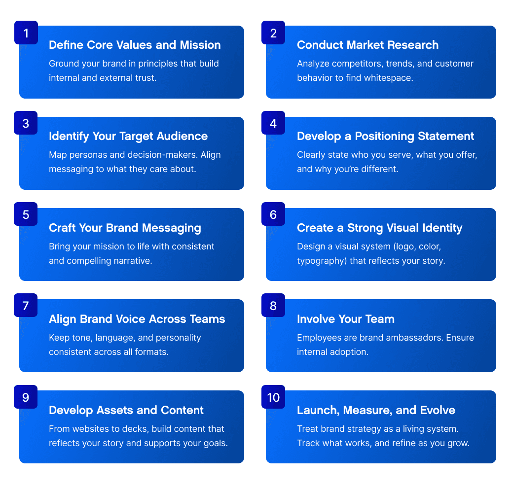
How to ensure you don’t end up with a bad logo Businesses can avoid design fails by following a clear process.
Audit and define your identity: know what your brand represents
Create with purpose: align typography, color, and shapes with values
Test with audiences: gather real feedback before launch
Avoid short-lived trends: today’s fun often becomes tomorrow’s dated
Work with designers: professionals ensure balance, clarity, and execution
Rebranding in the Digital Age
The digital revolution has transformed the way brands approach logo design and rebranding. Today, a logo isn’t just stamped on business cards or storefronts—it needs to look great on everything from tiny app icons to massive billboards, and across a dizzying array of digital platforms. This shift has raised the stakes for companies looking to refresh their brand identity.
Modern logos must be flexible, scalable, and instantly recognizable, whether viewed on a smartphone screen or a social media profile. The process of rebranding now involves thinking about how a logo will animate, adapt, and interact with users online. Brands that ignore these digital realities risk creating logos that feel outdated or fail to connect with today’s tech-savvy consumers.
Importantly, the digital age has also made it easier for audiences to share their opinions—good or bad—about a new logo. A misstep can go viral in minutes, turning a well-intentioned redesign into a global punchline. That’s why successful brands involve their audience early, test logos across digital touchpoints, and prioritize clarity and simplicity in their designs.
In a world where first impressions are made online, a logo must do more than look good—it must work everywhere, communicate instantly, and reinforce the brand’s identity at every digital turn.
How rebranding can fix a bad logo
The good news? A poor logo isn’t permanent. With careful rebranding, businesses can signal and restore recognition and trust.
Keep what works: don’t discard valuable equity
Modernize with balance: update typography and detail without losing character
Involve audiences early: prevent backlash by testing new ideas
A few examples of how we've helped brands achieve this while meeting strategic initiatives:

Source: Matic
Pluto Bio: a bold, modernized logo rooted in science.
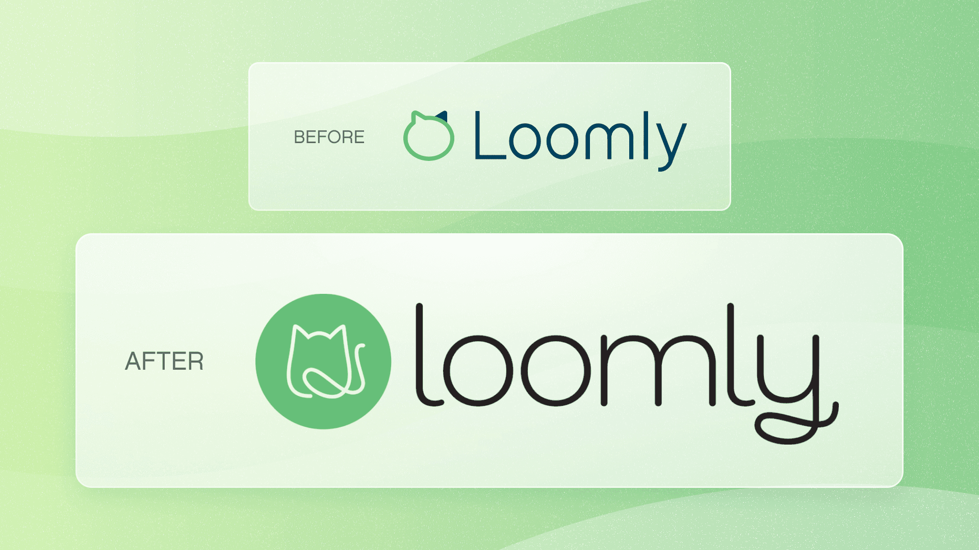
Source: Matic
Loomly: a refreshed logo that stayed true to its personality.
Lessons from the worst logo fails
The biggest takeaways from these design fails include:
Never strip away personality for generic fonts
Avoid meaningless or confusing symbolism
Always test logos across platforms and sizes
Respect the strength of original logos
Remember logos are more than shapes, they’re symbolic of your entire organizational purpose
Final thoughts: Designing logos that last
The worst logo stories prove that identity matters. When companies rush, overcomplicate, or ignore feedback, the results confuse rather than connect.
A logo isn’t just an image; it’s a the asset that the world either want to be associated with, or doesn't. Done wrong, it creates doubt and distance. Done right, it sparks excitement, recognition, and affiliation.
Matic takes an approach to logo design that balances modern aesthetics with timeless clarity. If you’re considering a rebrand or want to ensure your logo resonates with your audience, let’s create something that truly represents your business.

About Matic
We're a B2B transformation agency creating strategic advantage through branding, websites, and digital products.